
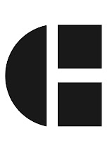

Logo idea 1
This logo is my favourite out of the 3 i have done.
There is a hidden meaning to this logo as i am trying to combine music into my design.
I have combined two music notes to give the effect of headphones.
I have used the font helvetica and made it bold.
I have joined the H from my forename and surname together and using kerning i have joined the letters closer together and i think this makes the logo look very effective.
No comments:
Post a Comment