Rough layout idea 1
As i am looking back through Peter Savilles work i thought of using an original design and extending it into my own. As i am talking about the artist, using a piece of his work will make the page instantly recognisable and attract the viewer who i am targeting. Would i need to email Peter Saville for permission? to use his work?
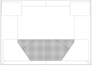 |
| Grid layout one - looking at this grid i am worried not enough information can be captured just from these two small type boxes, i might need to extend them. Also making lots of small boxes helps me add the extra detail needed for my own design. |
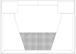 |
| I have extended the type boxes. |
link: http://rsadiq-media.blogspot.com/2009/01/nang-magazine-double-page-spread.html
Now i have made my rough layout and final grid i need to look at fonts,colours,audience,extended knowledge. I have found a website which gives me good information on this. I will take any ideas i think that will help me with my page spread.
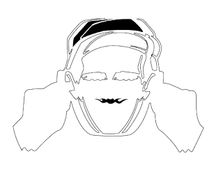 |
| Ok so its now time to take my idea to the computer. I will start by tracing the original image with the pen tool in illustrator. |
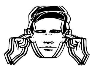 |
Now the design has been traced 100% i now need to start putting my own input to this design. I really like this design in black and white as it really shows of the image features (optical illusion)
Problem - My grid doesnt work with the image 100% so i will still use this structure but work with the text boxes once my main design is finished,
|
What do people think? i like my idea it really needs working with still but in my opinion looks very effective.





No comments:
Post a Comment